
What’s on the page
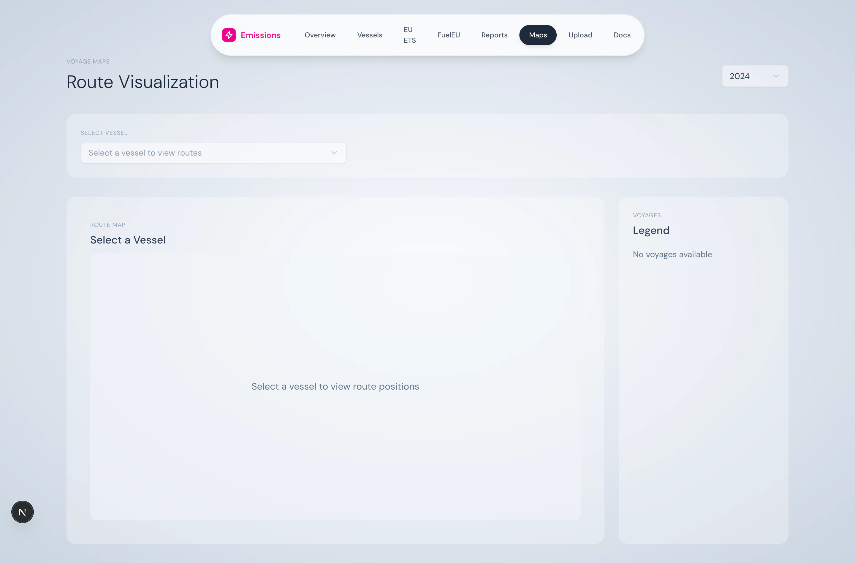
Vessel selector + year
A dropdown picks the vessel; the global year selector picks the year. Together they scope the position data shown.Map (Mapbox GL)
Voyage legend

- Colour indicator
- Voyage name / number
- Position count
- “Selected” badge when active
Voyage table (synced)

What you can do here
- Visually verify that a voyage was sailed where expected
- Trace a high-emissions voyage to its actual route
- Compare voyages by distance, fuel use, or ETS exposure side-by-side
- Use this view in customer/audit conversations as a more accessible alternative to a table
Tech note
The map uses Mapbox GL JS viareact-map-gl. There’s also a Leaflet-based fallback (VoyageMap) available if Mapbox tiles fail to load.
Source
Position data is read from/api/vessels/[imo]/positions. Voyage segmentation comes from VoyageSegmentService.