How data loads
The Trend Analysis tab uses two-stage progressive loading to deliver an instant render even with a year of data: Stage 1 — Instant render (< 500 ms) Daily aggregated data is fetched from/api/telemetry/aggregated and /api/health/aggregated. This returns 30–365 rows (~50 KB) and the charts render immediately.
Stage 2 — Background streaming
Raw 3-minute records are streamed via /api/telemetry/chunked in 500-record chunks with a 100ms pause between each chunk. Charts progressively sharpen as raw data replaces the aggregated view. A progress indicator appears in the bottom-right corner during streaming. Streaming is skipped automatically if total records exceed 50,000.
See Progressive Data Loading for the full technical explanation.
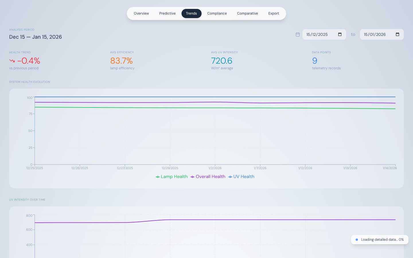
Date range filter
Controls at the top-right of the tab set the start and end date for all charts. The default range is 30 days back from the most recent telemetry record. Changing the date range triggers a fresh data load.Summary stat row
| Stat | Description |
|---|---|
| Health Trend | Percentage change in overall health score across the selected period, with a green (up) or red (down) trend icon |
| Avg Efficiency | Mean lamp efficiency across all 16 lamps for the period |
| Avg UV Intensity | Mean UVR_INTENSITY in W/m² for the period |
| Data Points | Number of telemetry records loaded (aggregated + raw) |
System Health Evolution chart
A line chart with three series over the selected date range:| Series | Colour | Field |
|---|---|---|
| Overall Health | Purple | overall_score |
| UV Health | Blue | components.uv_health |
| Lamp Health | Green | components.lamp_health |
UV Intensity Over Time chart
Full-width line chart showingUVR_INTENSITY in W/m² over the selected date range. X-axis labels are angled for readability. Use this chart to verify sustained compliance above the IMO threshold (252 W/m²) or USCG threshold (530 W/m²) over an extended period.
Lamp Efficiency Heatmap
An 8 × 2 grid of 16 cells — one per lamp — showing the period-average efficiency for each lamp. Colour coding matches the Overview tab’s diamond array:| Colour | Efficiency |
|---|---|
| Green | ≥ 90% |
| Yellow | 70–89% |
| Orange | 50–69% |
| Red | < 50% |
Lamp Efficiency & Power vs Runtime chart
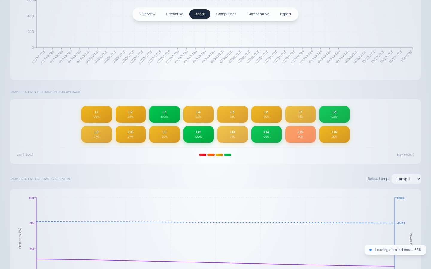
| Axis | Series | Description |
|---|---|---|
| Left Y-axis | Lamp Efficiency % (purple, solid) | Efficiency decline over runtime |
| Right Y-axis | Lamp Power Output (blue, dashed) | Power increase to compensate for degradation |
| X-axis | Cumulative runtime hours (10-hour buckets) |
/api/telemetry/runtime-analysis.
Lamp Efficiency vs System UV Intensity chart
A companion dual Y-axis chart:| Axis | Series | Description |
|---|---|---|
| Left Y-axis | Lamp Efficiency % (purple, solid) | Selected lamp’s efficiency |
| Right Y-axis | System UV Intensity W/m² (cyan, dashed) | Aggregate system intensity |
| X-axis | Runtime hours |
Source
| Data | Endpoint |
|---|---|
| Stage 1 telemetry | /api/telemetry/aggregated?interval=day |
| Stage 1 health | /api/health/aggregated?interval=day |
| Stage 2 raw streaming | /api/telemetry/chunked |
| Runtime charts | /api/telemetry/runtime-analysis |