> ## Documentation Index
> Fetch the complete documentation index at: https://docs.appliedaifoundation.org/llms.txt
> Use this file to discover all available pages before exploring further.
# Comparative Analysis Tab
> Hour-by-hour lamp efficiency comparison between any two of the 16 UV lamps over a selectable date range.
 ## What this tab shows
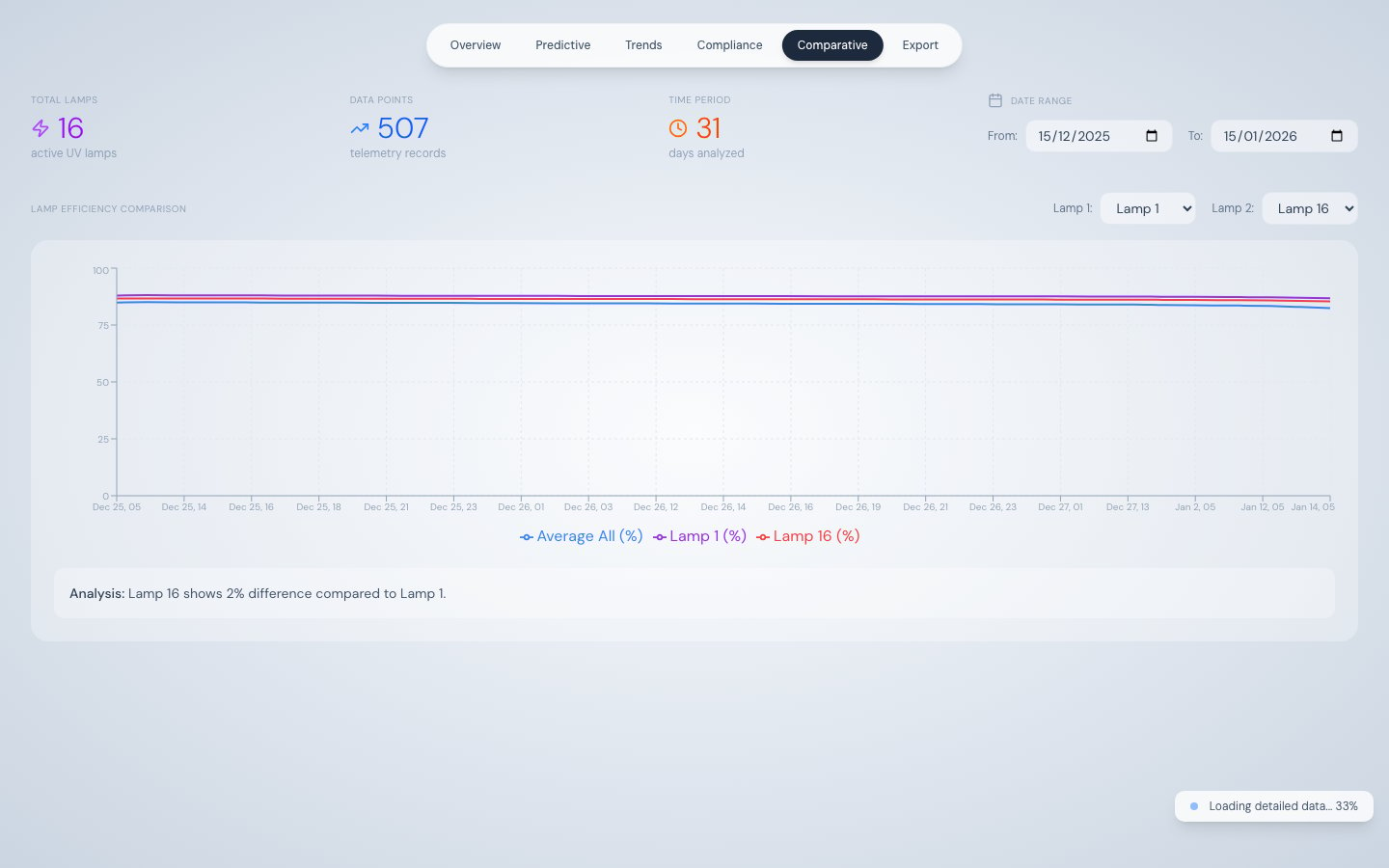
The Comparative Analysis tab plots two selected UV lamps side-by-side on a single chart, along with the fleet average efficiency across all 16 lamps. This makes it easy to:
* Compare a recently replaced lamp against an aged one to confirm the replacement was effective
* Identify lamps at opposite positions in the diamond array that show asymmetric degradation (possible flow distribution issue)
* Spot whether a lamp's decline is isolated or part of a broader fleet-wide trend
## Default selection
On first load, the tab compares **Lamp 1** vs **Lamp 16** over the previous 30 days. Both lamp selectors and the date range can be changed at any time.
## How data loads
The same two-stage progressive loading pattern used by Trend Analysis applies here:
1. **Stage 1** — Daily aggregated data renders the chart immediately
2. **Stage 2** — Raw 500-record chunks stream in the background, sharpening the chart to hourly resolution
A progress indicator appears bottom-right during streaming. Once streaming is complete, the chart shows up to 300 data points (downsampled if more hourly groups exist).
See [Progressive Data Loading](/methodology/progressive-loading) for full details.
## Lamp selector
Two dropdowns at the top of the tab select Lamp 1 and Lamp 2. Each offers Lamp 01 through Lamp 16. When the selection changes, the chart re-renders from already-loaded data — no additional API call is made.
## Chart detail
| Element | Description |
| ----------- | ------------------------------------------------- |
| X-axis | Datetime grouped hourly (format: Month/Day HH:00) |
| Y-axis | Efficiency 0–100% |
| Purple line | Selected Lamp 1 efficiency |
| Red line | Selected Lamp 2 efficiency |
| Blue line | Average efficiency of all 16 lamps |
## Analysis sentence
Below the chart, an automatically generated sentence computes the percentage difference between the two lamps' most recent efficiency values. For example:
> "Lamp 5 is operating at 4.2% higher efficiency than Lamp 12 based on the latest data."
## Summary stat row
| Stat | Description |
| ----------- | -------------------------------------------------------------- |
| Total Lamps | Always 16 |
| Data Points | Number of telemetry records loaded for the selected date range |
| Time Period | Number of days in the selected range |
## Source
| Stage | Endpoint |
| ------- | ----------------------------------------------------------------------- |
| Stage 1 | `/api/telemetry/aggregated?interval=day&startDate=...&endDate=...` |
| Stage 2 | `/api/telemetry/chunked?startDate=...&endDate=...&offset=...&limit=500` |
## What this tab shows
The Comparative Analysis tab plots two selected UV lamps side-by-side on a single chart, along with the fleet average efficiency across all 16 lamps. This makes it easy to:
* Compare a recently replaced lamp against an aged one to confirm the replacement was effective
* Identify lamps at opposite positions in the diamond array that show asymmetric degradation (possible flow distribution issue)
* Spot whether a lamp's decline is isolated or part of a broader fleet-wide trend
## Default selection
On first load, the tab compares **Lamp 1** vs **Lamp 16** over the previous 30 days. Both lamp selectors and the date range can be changed at any time.
## How data loads
The same two-stage progressive loading pattern used by Trend Analysis applies here:
1. **Stage 1** — Daily aggregated data renders the chart immediately
2. **Stage 2** — Raw 500-record chunks stream in the background, sharpening the chart to hourly resolution
A progress indicator appears bottom-right during streaming. Once streaming is complete, the chart shows up to 300 data points (downsampled if more hourly groups exist).
See [Progressive Data Loading](/methodology/progressive-loading) for full details.
## Lamp selector
Two dropdowns at the top of the tab select Lamp 1 and Lamp 2. Each offers Lamp 01 through Lamp 16. When the selection changes, the chart re-renders from already-loaded data — no additional API call is made.
## Chart detail
| Element | Description |
| ----------- | ------------------------------------------------- |
| X-axis | Datetime grouped hourly (format: Month/Day HH:00) |
| Y-axis | Efficiency 0–100% |
| Purple line | Selected Lamp 1 efficiency |
| Red line | Selected Lamp 2 efficiency |
| Blue line | Average efficiency of all 16 lamps |
## Analysis sentence
Below the chart, an automatically generated sentence computes the percentage difference between the two lamps' most recent efficiency values. For example:
> "Lamp 5 is operating at 4.2% higher efficiency than Lamp 12 based on the latest data."
## Summary stat row
| Stat | Description |
| ----------- | -------------------------------------------------------------- |
| Total Lamps | Always 16 |
| Data Points | Number of telemetry records loaded for the selected date range |
| Time Period | Number of days in the selected range |
## Source
| Stage | Endpoint |
| ------- | ----------------------------------------------------------------------- |
| Stage 1 | `/api/telemetry/aggregated?interval=day&startDate=...&endDate=...` |
| Stage 2 | `/api/telemetry/chunked?startDate=...&endDate=...&offset=...&limit=500` |